If you live in New York City, you've probably gotten used to seeing the Mad Men posters at your nearest subway station. I guess the advertising team behind the, hm, advertising show figured their fans or potential fans take trains. Good assumption. I usually love the way it looks against the red brick walls of the 49th Street station, because the posters are typically red-centric. This year's posters are not-so-much the case, they kind of clash. I can't say I don't like them, because I'm totally biased towards Milton Glaser and Mad Men. He simply can do no wrong. The psychedelic designs by the graphic design god are not for everyone. But more importantly, what do they tell us about the upcoming season? We've seen Don looking at undressed mannequins, an illustrated double Don, and now Don just gazing upon a Bacchanalia of flowers, swirls, and a female profile moving in on a glass of wine. Is this Don's imagination? Is this a zoomed in pattern on Megan's dress? Kidding.

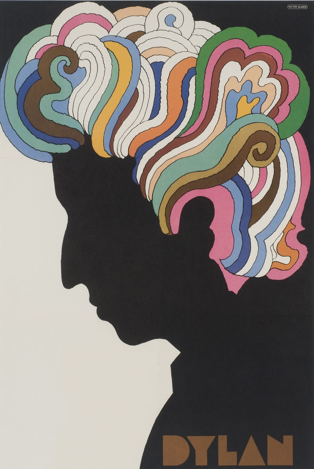
You probably heard Milton Glaser's name before. He's the designer of the I ♥ NY logo; whether you love it or hate it, there is no denying that it is iconic and has been imitated a bazillion times. Glaser also worked in advertising in the late-1960s, which certainly adds to his credentials pertinent to Mad Men. He also designed a poster for Bob Dylan, which this one is said to be based on. According to a New York Times article, the spire of the Chrysler Building can be found amongst the flower-power abstraction, although I can't seem to find it. If the poster reflects the upcoming half-season in any way, I'd be pretty glad.
No comments:
Post a Comment